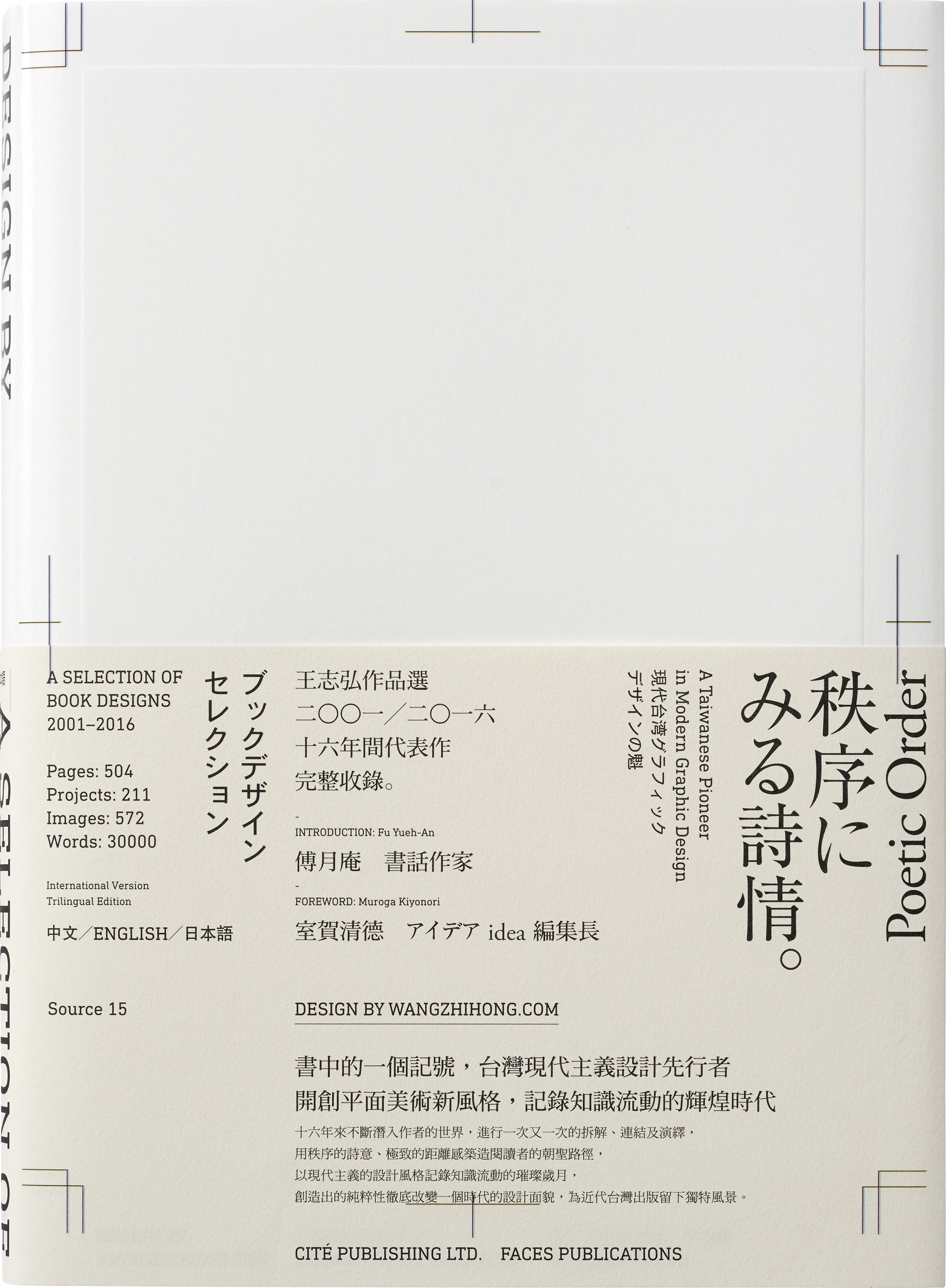
Design by wangzhihong.com:
A Selection of Book Designs,
2001-2016. *Out of Print
-
Hardback
-
Language TC/EN/JP
-
Size 6.69 x 9.44 inches
-
504 Pages
-
ISBN 978-986-235-533-6
- TWD 3,000 HKD 1,000
1 September 2016
Faces Publications
THE CRITICAL NATURE AND POSSIBILITIES INHERENT
IN THE WORK OF WANG ZHIHONG
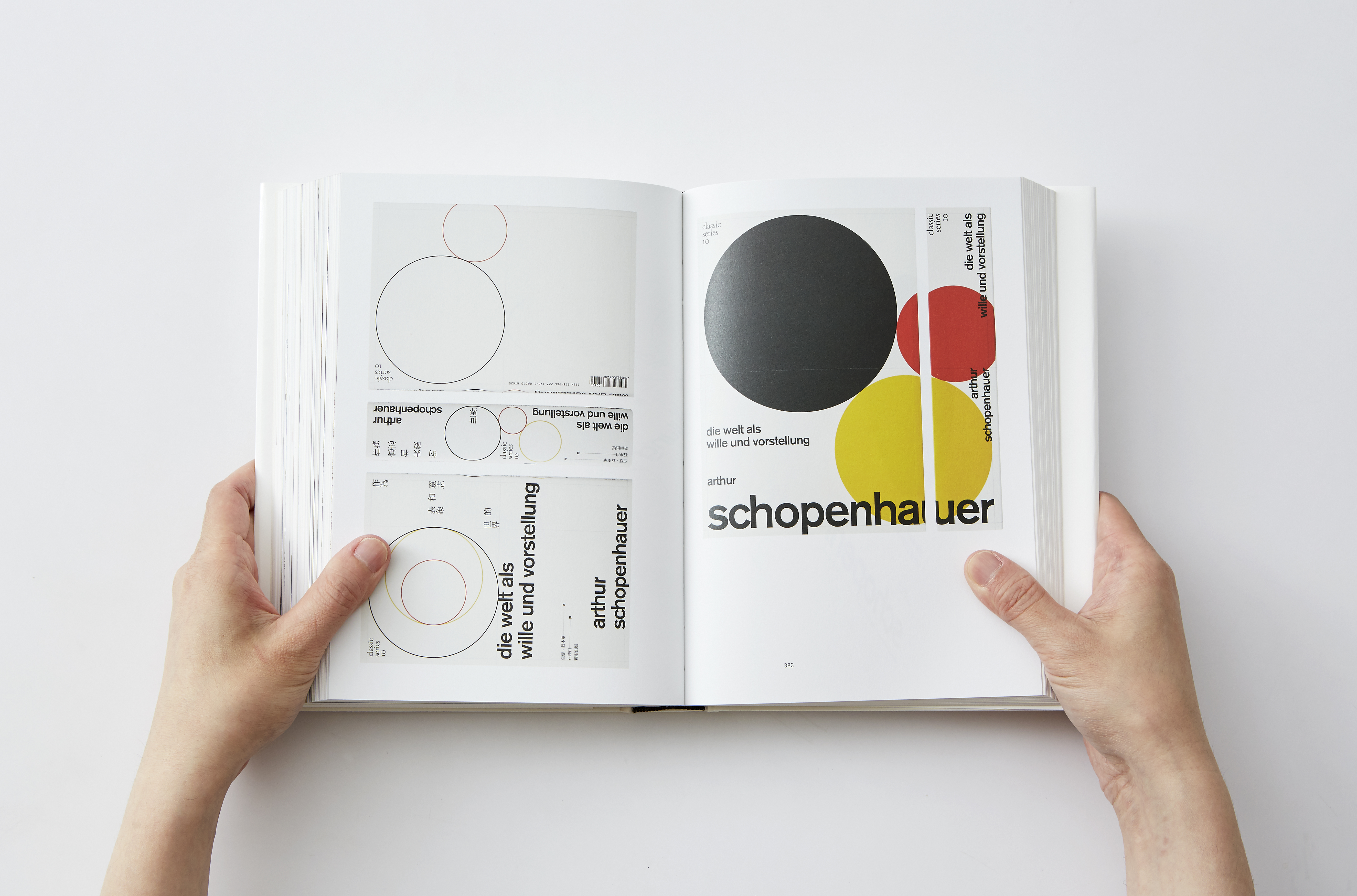
For Asian designers “modern design” is not something to transcend or overcome ideologically, but rather a foundation to be flexibly used every day. Moreover, from an historical perspective deliberately juxtaposing “Asian design” and Western design has no absolute value. It is against this backdrop that the possibilities inherent in a refreshingly new and youthful approach first became apparent in the early years of the New Millennium, most notably with the appearance of a young man from Taiwan called Wang Zhi-Hong. Wang made his presence felt in the world of book cover design in 2001, crafting a brand new design style that blended classicism and modernism with a distinctive focus on typography.
It has been Wang’s ability to reference and boldly combine elements from Taiwanese, Chinese, Japanese and Western cultures in his work, often in great detail, that has been so appealing and become a defining characteristic of his design style. Whether we look at the way in which Wang references history and culture or his focus on technical details, he has proved particularly adept at both, as evidenced by his array of impressive book covers. Although there are often only subtle differences between the norms and types of Japanese, Taiwanese and Chinese characters, Wang has still been able to flexibly put them to a wide range of applications. In this context, his methodology has transcended technique and aesthetics while establishing a direct link to the cultural character of East Asia. Wang Zhi-Hong’s bricolage design can be likened to the way in which Ming typeface modern moveable type printing technology arrived in Japan. The Japanese first took the typeface of Chinese wood block printing and then after replication using metal movable type from Europe and with the assistance of a printing company opened by Americans in Shanghai introduced the typeface in Japan, after making their own refinements. In other words, although on the surface the change may appear to have been relatively simple, it had lasting international and historical implications.
At times of major change such as these, creativity often contains the seeds of opportunity that give rise to the developments that define the next era. Wang Zhi-Hong’s designs make full use of the information technology that is integral to modern globalization. As such, they are imbued with the power of internationalism and showcase the wisdom of modern Asia. Wang has used Asian perception to drive his deconstruction of modern typography, with his inspiration and ideas containing their own power to perhaps facilitate new movement and exchange in the world of Chinese characters. If design circles in East Asia accept and embrace Wang’s creativity then we can expect to see major changes in the not too distant future.
MUROGA KIYONORI
Editor of Chief, IDEA Magazine
August 2016, Tokyo, JP
CORNER OF THE COVER
In the 1990s, many people were eager to work for advertising companies with their plethora of commercial images to play with but I found that unappealing and so decided to focus on typography. As a professional field that had been largely overlooked in Taiwan typography offered opportunities for future growth as well as the potential to ensure the more balanced development of graphic design. Ultimately, I launched my graphic design career by establishing a studio that focused on the unfashionable area of book cover design.
I did not really choose a career in book design. My initial thinking was more about finding a lifestyle and job that afforded me as much freedom as possible. However, as I look back I have now been involved with the publishing industry for the past 20 years. Whether working for bookstores, my involvement with architecture and interior design magazines or later more popular publications, publishing has played an important role in my life. Although as a graphic designer I have taken on a wide range of projects, it is the design of book covers that has allowed me to hone my skills and map out a professional direction. Even more important, this field has enabled me to develop and showcase my own distinctive approach to design.
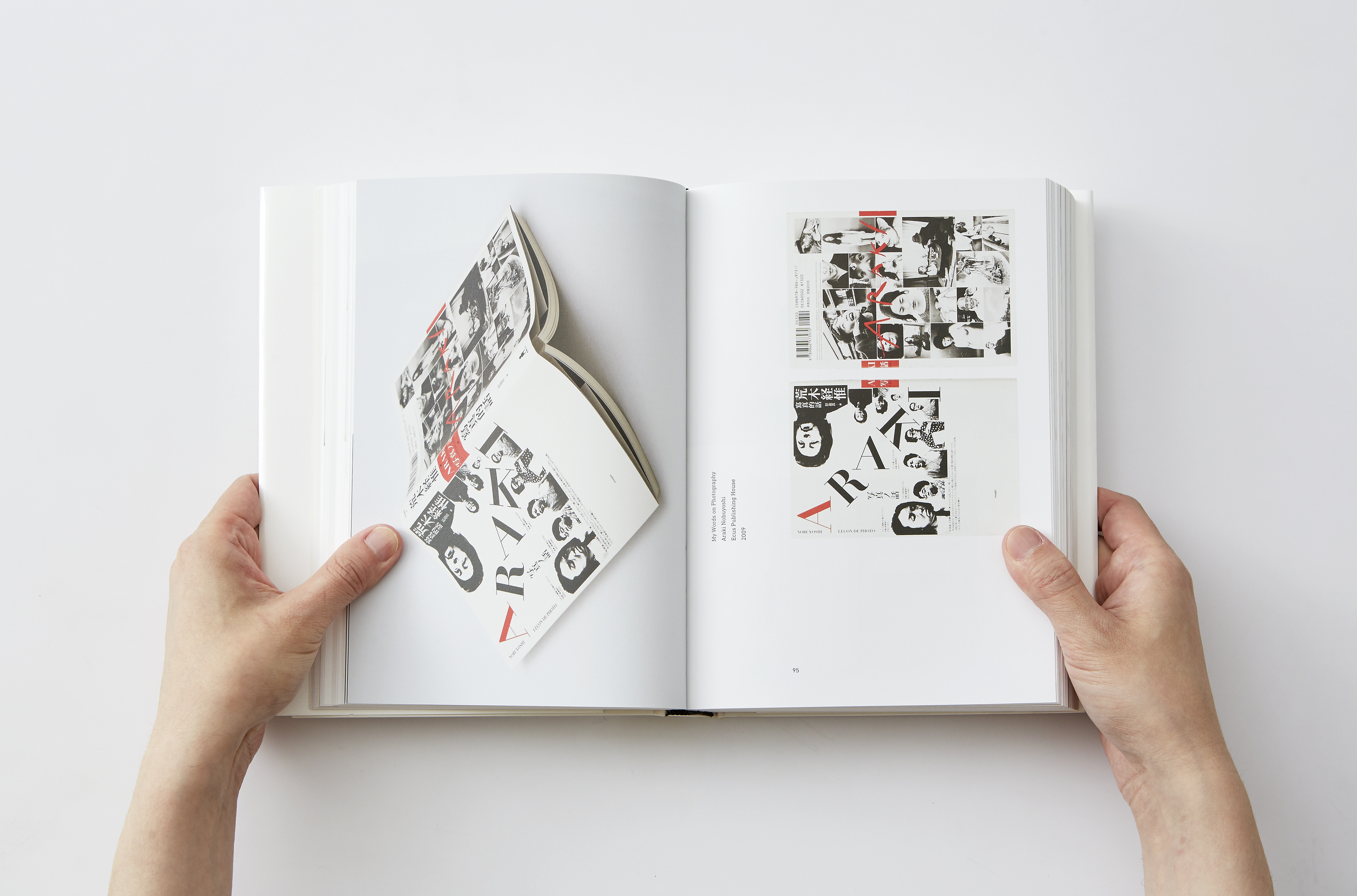
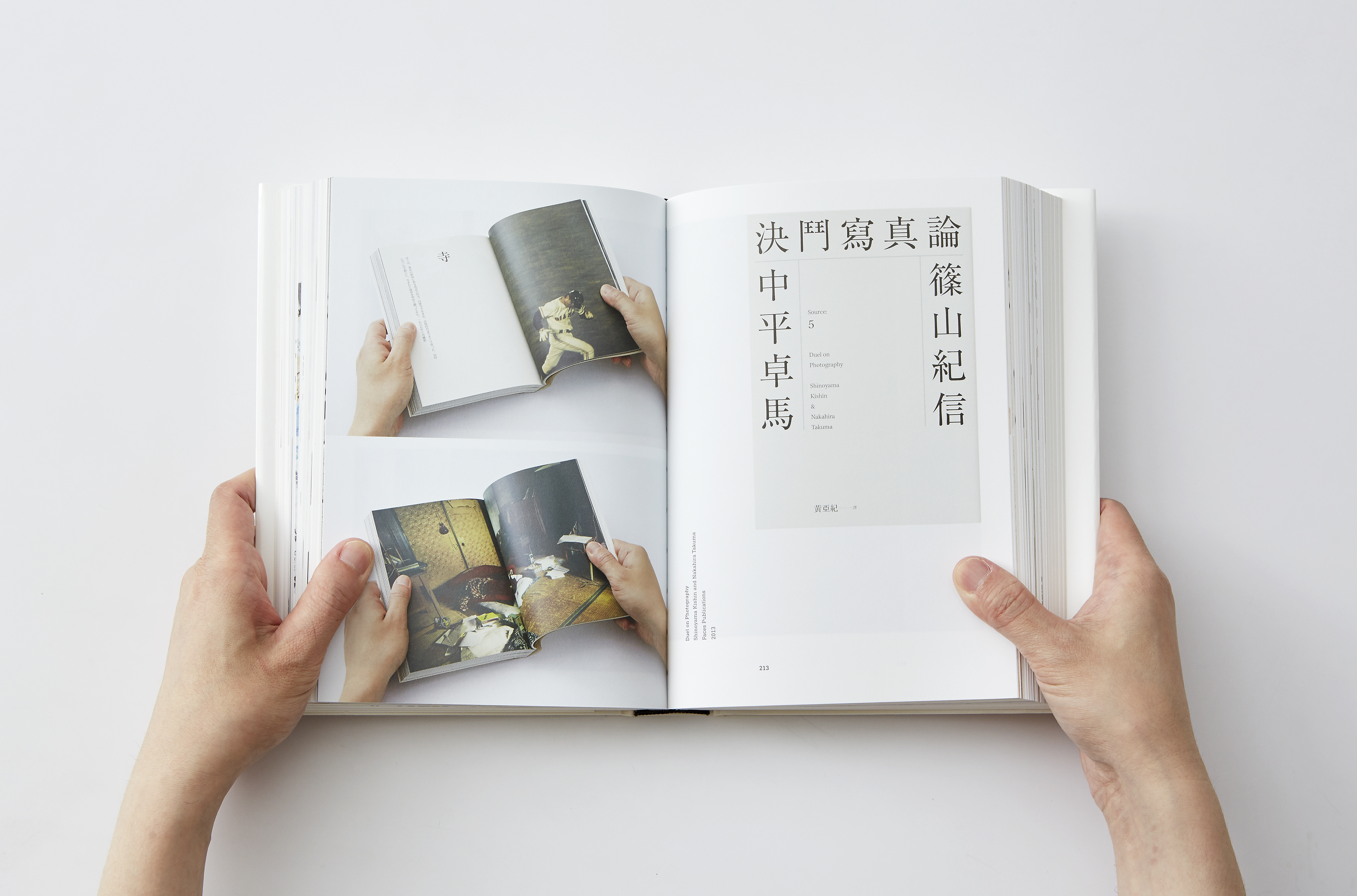
In 2008, recognizing the dearth of design and art related books in Taiwan I proposed a brand new method of cooperation to a publisher, whereby I would play a more active role in the publishing process in my capacity as a designer, from the selection of books to marketing and design. This involved utilizing the existing resources and experience of the publishing house to help me complete projects that came as close to realizing my ideal as possible. As a result, over the past nine years we have introduced many designers and artists who had not previously published books in Taiwan, including Araki Nobuyoshi, Sato Kashiwa, Satoh Taku, Yokoo Tadanori, Nakahira Takuma, Nagashima Yurie, Ohtake Shinro, Kawakubo Rei etc. Indeed, this arrangement continues to provide the Taiwanese public with a diverse range of excellent choices to enjoy and I too have grown from learning more about such talented individuals.
I am not sure when cover designers in Taiwan adopted the habit of including their own names in the corner of book covers, but I did likewise, always printing “Design by wangzhihong.com.” Although I rarely left just my full name and the marking was not always the same, changing over time or sometimes on impulse, it remained more or less the same. Ultimately, “Design by wangzhihong.com” became the impression I made on others and leaving it on the cover made it part of the book.
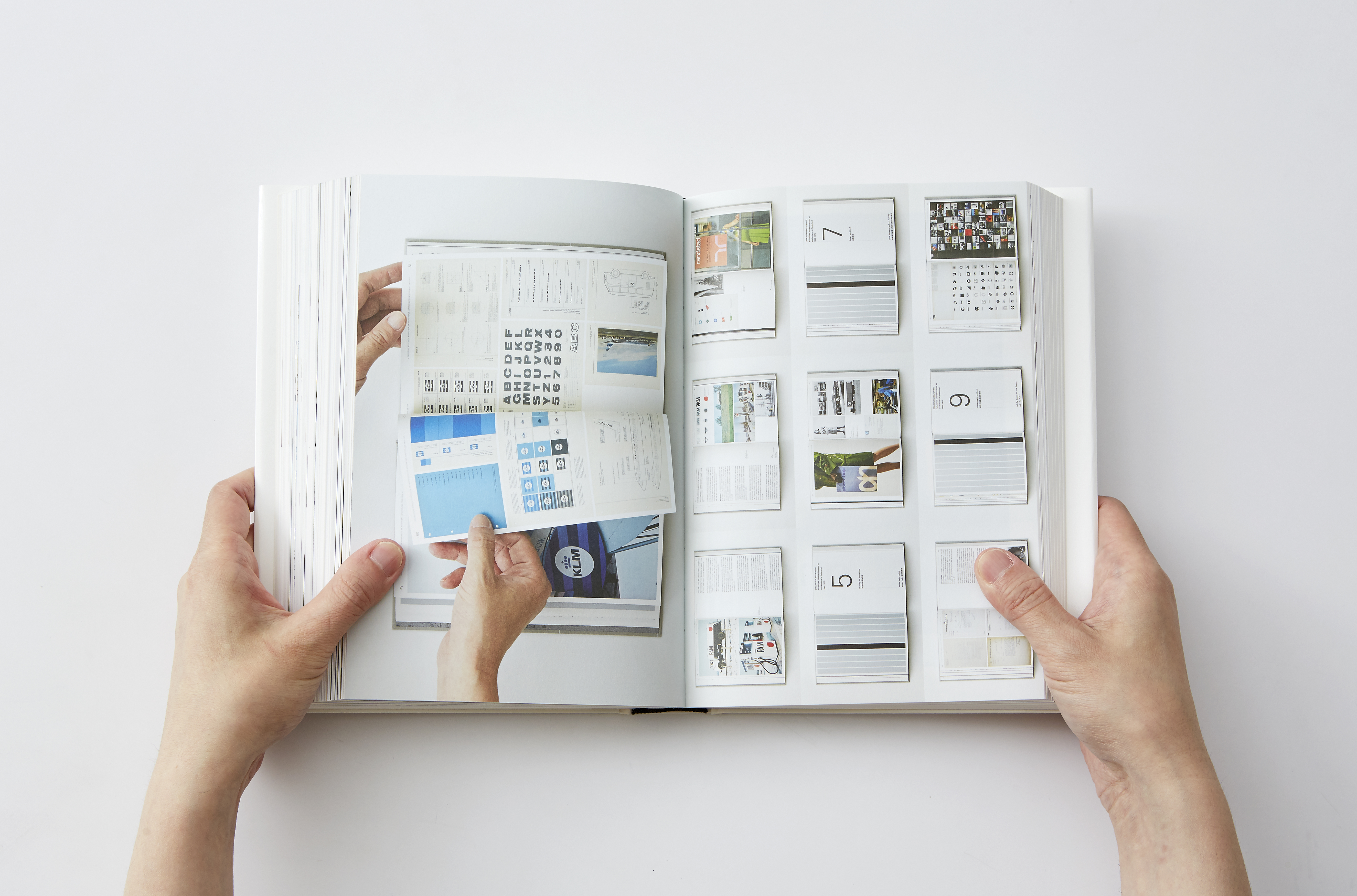
This collection of works is made up of two main parts: “Design by wangzhihong.com” brings together a selection of my works from 2001–2016 in a catalogue format, whereas those showcased under the title “Text by wangzhihong.com” discuss the thought process behind individual projects in more detail. Whether a catalogue entry or informal essay the pieces are organized chronologically and although some of the earlier works are a little rough and ready, this selection offers readers an introduction to my development as a professional designer. This includes different approaches and ideas that have informed the publishing environment in Taiwan, including the various experiments and explorations I have engaged in over the years.
Since the turn of the New Millennium, graphic design has undergone major changes in Taiwan with typography embracing a period of unprecedented expressiveness. As a result, book cover design has developed from a profession in which few people were interested into an intensely competitive field with many talented designers. In addition, it has also become one of the main points of entry for foreigners to understand the nature of Taiwanese graphic design, developments that were inconceivable when I first started designing in the late 1990s. I very much hope that this comprehensive and detailed record of the period proves informative and instructive for those seeking to better understand the increasingly popular field of book cover design in Taiwan.
WANG ZHIHONG
Art Director, Graphic Designer
July 2016, Taipei, TW
IN THE WORK OF WANG ZHIHONG
FOREWORD
For Asian designers “modern design” is not something to transcend or overcome ideologically, but rather a foundation to be flexibly used every day. Moreover, from an historical perspective deliberately juxtaposing “Asian design” and Western design has no absolute value. It is against this backdrop that the possibilities inherent in a refreshingly new and youthful approach first became apparent in the early years of the New Millennium, most notably with the appearance of a young man from Taiwan called Wang Zhi-Hong. Wang made his presence felt in the world of book cover design in 2001, crafting a brand new design style that blended classicism and modernism with a distinctive focus on typography.
It has been Wang’s ability to reference and boldly combine elements from Taiwanese, Chinese, Japanese and Western cultures in his work, often in great detail, that has been so appealing and become a defining characteristic of his design style. Whether we look at the way in which Wang references history and culture or his focus on technical details, he has proved particularly adept at both, as evidenced by his array of impressive book covers. Although there are often only subtle differences between the norms and types of Japanese, Taiwanese and Chinese characters, Wang has still been able to flexibly put them to a wide range of applications. In this context, his methodology has transcended technique and aesthetics while establishing a direct link to the cultural character of East Asia. Wang Zhi-Hong’s bricolage design can be likened to the way in which Ming typeface modern moveable type printing technology arrived in Japan. The Japanese first took the typeface of Chinese wood block printing and then after replication using metal movable type from Europe and with the assistance of a printing company opened by Americans in Shanghai introduced the typeface in Japan, after making their own refinements. In other words, although on the surface the change may appear to have been relatively simple, it had lasting international and historical implications.
“BOOK DESIGN OF WANG ZHI-HONG
CONGRATULATES THE NEXT ADOLESCENCE
IN DESIGN HISTROY IN EAST ASIA”
CONGRATULATES THE NEXT ADOLESCENCE
IN DESIGN HISTROY IN EAST ASIA”
At times of major change such as these, creativity often contains the seeds of opportunity that give rise to the developments that define the next era. Wang Zhi-Hong’s designs make full use of the information technology that is integral to modern globalization. As such, they are imbued with the power of internationalism and showcase the wisdom of modern Asia. Wang has used Asian perception to drive his deconstruction of modern typography, with his inspiration and ideas containing their own power to perhaps facilitate new movement and exchange in the world of Chinese characters. If design circles in East Asia accept and embrace Wang’s creativity then we can expect to see major changes in the not too distant future.
MUROGA KIYONORI
Editor of Chief, IDEA Magazine
August 2016, Tokyo, JP
PREFACE
In the 1990s, many people were eager to work for advertising companies with their plethora of commercial images to play with but I found that unappealing and so decided to focus on typography. As a professional field that had been largely overlooked in Taiwan typography offered opportunities for future growth as well as the potential to ensure the more balanced development of graphic design. Ultimately, I launched my graphic design career by establishing a studio that focused on the unfashionable area of book cover design.
I did not really choose a career in book design. My initial thinking was more about finding a lifestyle and job that afforded me as much freedom as possible. However, as I look back I have now been involved with the publishing industry for the past 20 years. Whether working for bookstores, my involvement with architecture and interior design magazines or later more popular publications, publishing has played an important role in my life. Although as a graphic designer I have taken on a wide range of projects, it is the design of book covers that has allowed me to hone my skills and map out a professional direction. Even more important, this field has enabled me to develop and showcase my own distinctive approach to design.
In 2008, recognizing the dearth of design and art related books in Taiwan I proposed a brand new method of cooperation to a publisher, whereby I would play a more active role in the publishing process in my capacity as a designer, from the selection of books to marketing and design. This involved utilizing the existing resources and experience of the publishing house to help me complete projects that came as close to realizing my ideal as possible. As a result, over the past nine years we have introduced many designers and artists who had not previously published books in Taiwan, including Araki Nobuyoshi, Sato Kashiwa, Satoh Taku, Yokoo Tadanori, Nakahira Takuma, Nagashima Yurie, Ohtake Shinro, Kawakubo Rei etc. Indeed, this arrangement continues to provide the Taiwanese public with a diverse range of excellent choices to enjoy and I too have grown from learning more about such talented individuals.
“DESIGN BY WANGZHIHONG.COM”
I am not sure when cover designers in Taiwan adopted the habit of including their own names in the corner of book covers, but I did likewise, always printing “Design by wangzhihong.com.” Although I rarely left just my full name and the marking was not always the same, changing over time or sometimes on impulse, it remained more or less the same. Ultimately, “Design by wangzhihong.com” became the impression I made on others and leaving it on the cover made it part of the book.
This collection of works is made up of two main parts: “Design by wangzhihong.com” brings together a selection of my works from 2001–2016 in a catalogue format, whereas those showcased under the title “Text by wangzhihong.com” discuss the thought process behind individual projects in more detail. Whether a catalogue entry or informal essay the pieces are organized chronologically and although some of the earlier works are a little rough and ready, this selection offers readers an introduction to my development as a professional designer. This includes different approaches and ideas that have informed the publishing environment in Taiwan, including the various experiments and explorations I have engaged in over the years.
“2001 – 2016”
Since the turn of the New Millennium, graphic design has undergone major changes in Taiwan with typography embracing a period of unprecedented expressiveness. As a result, book cover design has developed from a profession in which few people were interested into an intensely competitive field with many talented designers. In addition, it has also become one of the main points of entry for foreigners to understand the nature of Taiwanese graphic design, developments that were inconceivable when I first started designing in the late 1990s. I very much hope that this comprehensive and detailed record of the period proves informative and instructive for those seeking to better understand the increasingly popular field of book cover design in Taiwan.
WANG ZHIHONG
Art Director, Graphic Designer
July 2016, Taipei, TW